
You must produce a Gantt and a PERT chart in your Horizon Europe proposal. Let’s review together the differences between the two and how to draw them.
The Gantt chart
The Gantt chart was created by Henry Gantt in 1917 and is still today a widely used tool in project management. The Gantt chart is a graphical representation of the timing of your project’s work packages and tasks as well as deliverables and milestones. Its main purpose is to show how the different project’s items are planned in time, but it also shows the links between them. To design a Gantt chart, list all the items (work packages, tasks, deliverables and milestones) in rows, put the time divisions in the right order (for example months) in columns, and draw a dot or a line at the date or between the starting and end dates of each item. You can also represent the links between them, for example when a task’s deliverable is used by another task. This is an excellent tool to check if your project is planned properly.

The PERT chart
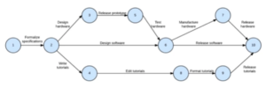
PERT is an acronym that stands for Program Evaluation and Review Technique and was developed by the US Navy in the 1950s. It is a graphical representation of the links between tasks represented as a network. It does not show directly the timing of each task. To design a PERT chart, create a circle per event (a milestones or a deliverable) in which you put the earliest completion date and the latest. Link the circles according to the tasks required to link 2 events. Draw your events and tasks from left to right in the chronological order they happen. This way, you get a representation of the dependency of the tasks and especially the critical path of the project, i.e. the path between tasks that gets the shortest delivery of the project.
The key differences between the two
First, there is a graphical difference: PERT charts are diagram charts while Gantt charts are bar charts. Then, there is a difference in purpose: a PERT chart focuses on the dependency of relationships between tasks while a Gantt chart focuses on the time required to complete a task. The time to use each chart also varies: a PERT chart is preferable at the beginning of the project as it allows to plan for its duration while a Gantt chart is better used during the project since it is easier to modify it as the project goes. Finally, there is a difference in simplicity: a Gantt chart is a more straightforward and simpler graphical representation of a project, while the PERT chart can be more confusing in a large project; however, the PERT chart allows to identify the critical path, which the Gantt chart does not allow.
Are there any alternative to PERT chart?
The European Commission requires a PERT chart or similar, which means there should be some alternatives to PERT charts… and they exist! The first is the WBS (Work Breakdown Structure). The WBS divides the project into work packages, tasks and subtasks and represents them graphically in hierarchical columns. Thus, a task cannot be completed if its related subtasks are not completed either. It is the best representation to define the hierarchy of parent and child tasks but it does not plot time at all.

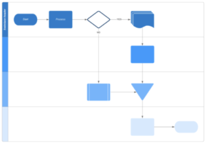
Another alternative to PERT charts is the cross-functional flowchart. It can prove useful in a Horizon Europe consortium because it separates the work in teams. It tracks dependencies or transfer of information or deliverables from one team to another. In a cross-functional flowchart, the teams are represented in rows and the timeline is in columns.
Finally, the alternative used in most of the Horizon Europe proposals is to draw a flow chart of the work packages instead of the tasks. There is no representation of time at all, but only of the links between the work packages. The links are represented by arrows between boxes for work packages. While this representation seems not to bother the Horizon Europe proposal reviewers too much, there is a few considerations to make. First, include all your work packages, even those who do not have a link with others. Just represent them as isolated boxes. Then, choose carefully the links you represent; the most relevant are deliverables. Finally, position all the elements in a coherent way to simplify the reading of the chart.